Published by November 29, 2025 · Reading time 19 minutes · Created by Lix.so
Getting your Meta ad sizes right isn't just a box-ticking exercise; it's one of the first and most critical steps for any successful campaign. Nailing the specs ensures your ads look sharp and professional across every single placement, from the Feed to Stories and beyond.
Think of it this way: properly formatted ads prevent ugly, awkward cropping, which in turn helps boost your click-through rates and can even lead to lower ad costs. It's the groundwork for maximizing your return on ad spend.
Optimizing your creatives for each specific placement isn't optional anymore—it’s absolutely fundamental. If your images or videos don’t fit the recommended dimensions, Meta’s algorithm will take matters into its own hands, automatically cropping or resizing them to fit.
This almost always ends badly. Your logo gets chopped off, your call-to-action disappears, or the whole thing becomes a blurry, low-quality mess. It instantly undermines your brand's credibility. A vertical 9:16 ad built for Instagram Stories is going to look completely broken if it's forced into a square 1:1 Facebook Feed slot. The message gets lost, and the user just keeps scrolling.
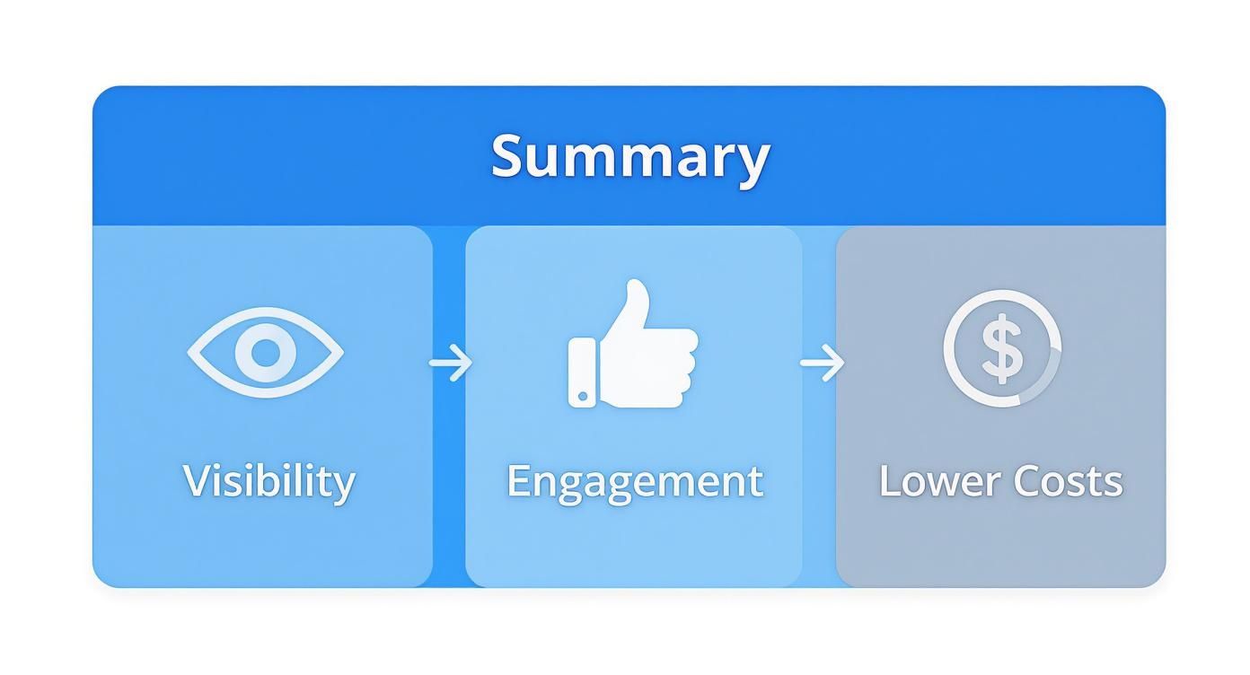
Ignoring the proper ad specs will hit your bottom line, simple as that. Ads that are visually tailored to their placement feel native to the platform, command more attention, and just plain perform better.
Here’s exactly how getting the sizes right helps your campaigns:
For advertisers who need specs on the fly, this cheat sheet is your go-to. It’s a quick, scannable summary of the most common Meta ad sizes, perfect for when you just need the numbers without digging through long articles.
Think of it as the foundation. Whether you're a seasoned pro who just needs a quick reminder or you're getting your first campaign off the ground, these are the core specs that will get your creative formatted correctly from the start.
Getting these specs right is the first step toward making ads that look professional and native to the platform. The table below breaks down the must-knows for the highest-impact placements on Facebook and Instagram.
Here's a quick-lookup table showing the core specifications for the most popular Meta ad placements on Facebook and Instagram.
| Placement | Recommended Dimensions (Pixels) | Aspect Ratio | Max File Size |
|---|---|---|---|
| Feed (Image/Video) | 1080 x 1350 (Vertical) | 4:5 | 30MB / 4GB |
| Stories (Image/Video) | 1080 x 1920 (Vertical) | 9:16 | 30MB / 4GB |
| Reels (Video) | 1080 x 1920 (Vertical) | 9:16 | 4GB |
| Carousel (Image/Video) | 1080 x 1080 (Square) | 1:1 | 30MB / 4GB |
Pro Tip: While the 1:1 square ratio works almost anywhere, don't sleep on the 4:5 vertical format for Feeds. It takes up significantly more screen real estate on mobile, which can be a game-changer for grabbing attention and boosting engagement.
Following these guidelines ensures your ads show up looking crisp and professional, which directly impacts everything from visibility to your final campaign costs.
The bottom line is simple: optimizing your Meta ad sizes isn't just a technical step; it's a strategic one. It prevents common headaches like awkward cropping, blurry images, or even ad rejections. When your creative is perfectly tailored to each placement, you give your campaigns a real shot at success and a much better return on investment.
Think of the Facebook and Instagram Feeds as the original, prime-time real estate for advertisers. This is where users scroll through updates from friends, family, and pages they follow, so your ad needs to fit in naturally while still being strong enough to stop their thumb mid-scroll. Nailing the meta ad sizes for this placement isn't just a best practice—it's essential for looking professional and getting results.
Unlike the full-screen, vertical-only world of Stories and Reels, the Feed gives you more breathing room with aspect ratios. This flexibility is great for testing different creative styles, but it also means you need to know which format will actually work best for your campaign goals.
When it comes to static images, Meta supports a few different shapes, but one has clearly pulled ahead as the champion for mobile feeds. Understanding the difference is key to making your ad pop.
Pro Tip: If you can only create one image format for the Feed, make it the 4:5 vertical. That extra screen real estate it commands almost always translates to higher engagement and better ad recall, giving your campaign a serious edge.
No matter which dimensions you choose, stick to JPG or PNG file types. And keep your file size under 30MB to prevent Meta from compressing your image and tanking its quality.
Video ads in the Feed use similar aspect ratio rules as images, but they come with their own set of technical specs. Getting these right is crucial, because a well-optimized video has the power to hold a user's attention in a way static images just can't.
Meta’s specs have been pushing advertisers toward mobile-first video for years. While a square 1080 x 1080 pixel video still works just fine, the 4:5 aspect ratio is now strongly recommended to grab maximum attention. For files, you can go up to 4GB, but smaller is always better for faster load times. This shift just reinforces the move toward vertical video, which you see taken to its extreme in Stories and Reels with their mandatory 9:16 format.
Here are the must-know specs for video:
If you want to go deeper into crafting the perfect video ad, check out our complete guide on video dimensions for Facebook ads. Choosing the right meta ad sizes is the first—and most important—step to building ads that connect with your audience and actually drive results.
The move to vertical, full-screen video is no longer a trend—it's the standard. For advertisers, this means mastering placements like Facebook Stories, Instagram Stories, and Instagram Reels is absolutely critical. These formats are built for total immersion, designed to capture 100% of a user's attention on their phone. Getting the meta ad sizes right here isn't just a best practice; it's non-negotiable if you want your ads to look professional and native to the platform.
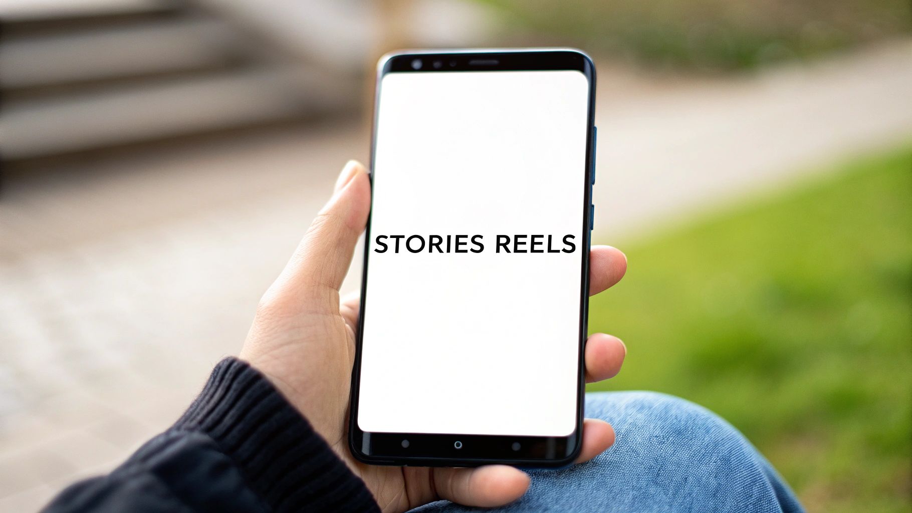
Unlike the more forgiving Feed placements, Stories and Reels have one strict rule: you must use a 9:16 aspect ratio. This is the only option. It’s what allows your ad to fill the entire screen, creating that seamless experience. If you try to use any other ratio, Meta will slap awkward black or colored bars above and below your creative. It’s an instant giveaway that you've cut corners, and it makes your ad stick out for all the wrong reasons.
For the best quality, your go-to dimension for these placements should be 1080 x 1920 pixels. This resolution ensures your images and videos look crisp and sharp on any modern smartphone.
Just because your creative fills the whole screen doesn't mean the whole screen is viewable. Meta overlays crucial interface elements—like the profile icon, username, and call-to-action buttons—right on top of your ad. If you place your logo or headline text in these areas, it’s going to get covered up. This is precisely why understanding the "safe zone" is so important.
The safe zone is simply the central part of your 9:16 creative that is guaranteed to be free of any obstructions. To play it safe, keep all your essential elements away from the very top and bottom edges.
By keeping your message, logo, and key visuals within this central area, you make sure nothing critical gets hidden from view, no matter what device someone is using.
Beyond the dimensions and safe zones, you'll need to stick to a few technical requirements for both image and video ads in these vertical spots. Following these rules ensures your ads run smoothly and look their best.
For Both Image and Video Ads:
Image-Specific Specs:
Video-Specific Specs:
One last piece of hard-earned advice: always design for sound-off viewing. A huge number of people watch Stories and Reels with the audio muted. If your message relies on sound, it will be lost. Use clear, easy-to-read subtitles or text overlays to make sure your message lands every single time.
If you need an even deeper dive into Story-specific requirements, check out our complete guide on the perfect Facebook Story size. Mastering these full-screen meta ad sizes is your ticket to creating powerful, thumb-stopping campaigns.
Once you move beyond single images and videos, you open up a world of more interactive ad formats. Carousel and Collection ads are absolute workhorses for showcasing multiple products, highlighting different features, or walking a user through a compelling story.
Getting the Meta ad sizes right for these multi-asset ads is even more critical. One wrong dimension can throw off the entire user experience, making your ad feel clunky instead of seamless.
Carousel ads let people swipe through up to ten images or videos in a single ad unit, each with its own headline, description, and link. They're perfect for telling a step-by-step story or displaying a range of products. Think of each "card" in the carousel as a mini-ad that needs to look just right.
For maximum consistency, the square 1:1 format is the undisputed champion for Carousels. It’s the safest bet to ensure your cards look great everywhere—Feed, Messenger, you name it—without any awkward or unexpected cropping.
Remember, each card has its own headline and description. Don't just copy-paste! You've got an incredible amount of creative real estate here, so use it wisely.
Collection ads are a dream come true for e-commerce. They pair a primary cover image or video with a product catalog that opens into a full-screen, shoppable Instant Experience when someone taps. It’s designed to slash the friction between seeing a product and buying it.
The cover media is your ad's first impression, so its specs are everything.
Key Insight: The real power of a Collection ad is how it bridges the gap between storytelling and shopping. The cover asset hooks the user, and the fast-loading Instant Experience keeps them engaged in a rich catalog without ever having to leave the app.
Your cover asset can be a static image or a video and should generally follow the standard Feed specifications to look its best.
But the work doesn't stop with the cover media. The real magic happens after the tap, when your product catalog fills the Instant Experience. If your product feed has low-quality images or is out of date, the whole ad falls flat. Keeping that catalog pristine is just as important as the ad itself.
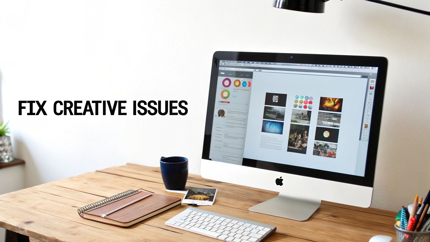
Even when you've nailed the meta ad sizes, creative issues can still pop up and derail a campaign before it even gets off the ground. From blurry images to rejected ads, knowing how to fix these common headaches is a non-negotiable skill for any advertiser. The good news? Most of these problems come from small mistakes that are easy to fix once you know what to look for.
A classic complaint is seeing your ad look blurry or pixelated once it's live, even though the original file was perfectly crisp. This almost always happens when you upload an image or video that's too small for the placement, forcing Meta to stretch it to fit. Always stick to the recommended resolutions, like 1080x1080 pixels for square assets or 1080x1920 pixels for Stories, to keep that quality sharp.
Another huge headache is unexpected cropping. You’ve designed the perfect ad, you hit launch, and later you find out your logo or call-to-action has been chopped off. This is the classic result of using one creative across multiple placements with different aspect ratios—like trying to force a square 1:1 ad into a vertical 9:16 Story slot.
To get ahead of this, you should be using Meta’s own tools before you spend a single dollar.
If your ad gets rejected, don't panic. The most common culprit is a policy violation, and it often comes down to the creative itself. For instance, Meta got rid of the strict "20% text" rule years ago, but ads with too much text slapped over an image can still get hit with reduced reach or even an outright rejection. The system just prefers clean, high-quality imagery.
Key Takeaway: The best troubleshooting strategy is always prevention. Using Asset Customization to provide placement-specific creative cuts off most cropping, quality, and formatting problems at the source.
Getting these fixes down is all part of a larger strategy. You can dive deeper into Facebook ads creative management best practices in our detailed guide. Taking that extra time to tailor your assets isn't just about looks—it builds trust and drives much better campaign results.
Even experienced advertisers have questions when it comes to the nitty-gritty of Meta's ad specs. The rules can feel like they're constantly shifting, especially with all the different placements available. Here are some quick, straightforward answers to the questions we hear most often.
Getting these details right from the start is the difference between a campaign that looks sharp and one that wastes your budget on sloppy, unprofessional ads.
If you upload an image that doesn't fit the placement, Meta's system will usually try to "fix" it by automatically cropping your creative. The results are often disastrous. Think chopped-off logos, half-visible products, or unreadable calls to action.
For vertical placements like Stories or Reels, you might see ugly colored bars slapped onto the top and bottom of your ad to fill the empty space. The best way around this is to use the Asset Customization feature, which lets you upload a perfectly sized creative for each specific placement.
Key Takeaway: Don't ever count on Meta's auto-cropping to do the job right. Always use the ad preview tool to see how your creative looks everywhere. Better yet, create dedicated assets for your most important formats, like Feed (4:5) and Stories (9:16), to keep complete control over how your brand is presented.
Technically, yes, but you'll be sacrificing performance. A 1:1 square aspect ratio (1080 x 1080 pixels) is the most forgiving format; it will run in most places without getting butchered. But "working" isn't the same as "working well."
A square ad in a vertical, full-screen placement like Instagram Stories just looks small and out of place. It screams "I'm an ad" and fails to create that immersive experience you're paying for. If you want the best results, you need to tailor your creative to the placements that matter most to your campaign.
Meta has relaxed its old, strict rule of automatically rejecting ads with more than 20% text on the image. That said, the principle behind it is still very much alive.
The ad delivery system still analyzes how much text is on your creative. If it detects too much, your ad might see its reach significantly throttled, or it might not run at all. Meta's official stance is to keep the text on your image or video to a minimum. Let your visuals do the talking and save the heavy copy for the primary text and headline fields where it belongs. The algorithm will thank you for it.
Ready to stop wasting time on manual campaign setups? Lix.so lets you launch entire Meta ad campaigns in seconds. Upload creatives in bulk, use powerful templates, and get back to focusing on strategy. Start your free trial at lix.so.
Create hundreds of Facebook Ads campaigns in minutes with Lix.so. Batch creative upload, reusable templates, and automatic campaign generation.
✓ Free for 14 days · ✓ No credit card required · ✓ Cancel anytime