Published by December 13, 2025 · Reading time 21 minutes · Created by Lix.so
For most ad campaigns, the sweet spot is 1080x1080 pixels. That 1:1 square format is your most versatile player, performing incredibly well across the highest-value, mobile-first placements like the Facebook Feed. It’s where most of your engagement is going to happen, so you want to get it right.
Picking the right ad dimensions is more than just a technical step—it's critical for getting the most out of your budget and actually grabbing someone's attention. While Facebook’s ad platform is pretty flexible, the 1:1 square format really hits that perfect balance of visibility and compatibility across most places your ad will show up.
A square ad ensures your creative looks sharp and intentional, without any of the weird, awkward cropping that instantly screams "low-effort ad" to a savvy user. But let's be real, a one-size-fits-all approach isn't always the best. If you're going for those immersive, full-screen experiences in Stories or Reels, you'll need different specs. The name of the game is matching your creative to the native feel of the placement.
To make this super simple, the most common ad sizes really boil down to three main aspect ratios. Think of these as the foundation of any solid multi-placement ad strategy.
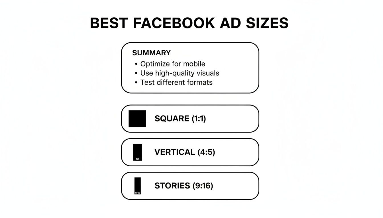
This visual breaks down the essentials: the go-to square (1:1), the slightly taller vertical (4:5), and the all-in full-screen for Stories (9:16). Nail these, and you're covering the most valuable real estate on Facebook.
Key Takeaway: If you only focus on a few sizes, make it these three. Prioritize creating assets in 1:1 (1080x1080 px) for Feeds, 4:5 (1080x1350 px) for taller feed ads that grab a bit more screen space, and 9:16 (1080x1920 px) for Stories and Reels. Mastering these will set you up for success.
To give you a quick reference, I've put together a table summarizing the most effective ad sizes for the placements that typically drive the best results. These are the specs my team and I rely on day in and day out.
| Placement | Recommended Ad Size (Pixels) | Aspect Ratio | Best For |
|---|---|---|---|
| Facebook Feed | 1080 x 1080 px | 1:1 | The most versatile format for images and videos, maximizing visibility on mobile. |
| Facebook Stories/Reels | 1080 x 1920 px | 9:16 | Full-screen, immersive video and image ads that feel native to the placement. |
| Facebook In-Stream Video | 1920 x 1080 px | 16:9 | Standard landscape video, perfect for ads that run within other video content. |
| Facebook Right Column | 1080 x 1080 px | 1:1 | A compact, desktop-only format where square ads perform well without cropping. |
Keep this table handy when you're briefing your design team or building out your next campaign. Sticking to these recommendations will help ensure your ads look professional and perform their best, no matter where they appear.
The data doesn't lie: mobile-first designs win. The compact square format consistently proves to be the most efficient for reach, delivering an average of 2,417 users reached for every $10 spent.
This isn't a coincidence. It reflects how Facebook's algorithm rewards mobile-native designs, especially since mobile devices now account for a staggering 94.1% of all ad impressions. Square ads simply look and perform better on the smartphones where almost everyone is scrolling. To get the full breakdown for every single placement, you can dive into our complete guide to Meta ad sizes. This approach ensures your ads aren't just getting seen—they're doing it in the most cost-effective way possible.
Getting your ad dimensions right isn't just a technical box to tick—it's one of the most fundamental parts of making your campaigns work. When your ad's size and shape fit the placement perfectly, it feels native to the user's feed. It looks professional. And that seamless experience is what builds trust and drives engagement.
On the flip side, an ill-fitting ad is a dead giveaway that you've cut corners, and it’s a surefire way to waste your ad spend. Imagine scrolling through Instagram Stories and seeing a square ad with ugly, automatically-generated bars filling the empty space. It screams "lazy ad" and immediately cheapens your brand. This kind of poor user experience tanks your click-through rates (CTR) and torpedoes your return on ad spend (ROAS).

To really nail your creative, you need to get comfortable with a few key terms. These are the building blocks of any good ad design.
Resolution: This is simply the number of pixels that make up your image, usually written as width x height (like 1080 x 1080 pixels). Higher resolution means a sharper, cleaner-looking ad. If you upload a low-res image, Facebook's compression algorithms will have a field day with it, leaving you with a blurry, pixelated mess.
Aspect Ratio: This term describes the proportional relationship between an image's width and its height. It’s written as a ratio, like 1:1 for a perfect square or 9:16 for a tall, vertical video made for Stories. Getting this right is critical because different placements are designed for different shapes. For a deeper dive, check out this excellent Instagram video aspect ratio guide to see how these same principles apply across the Meta ecosystem.
Safe Zones: This is the golden rule for full-screen placements like Stories and Reels. The safe zone is the central area of your creative that is guaranteed to be visible, clear of any pesky interface elements like your profile icon, the "Send Message" bar, or calls-to-action. You have to keep your logo, key text, and CTAs inside this area, or they'll get covered up.
When you upload creative with the wrong dimensions, you're essentially letting Meta's automated system make design choices for you. And trust me, it’s not a very good designer.
A one-size-fits-all approach is one of the most common—and costly—mistakes I see. Forcing a landscape video into a vertical Story placement results in a tiny video sandwiched between massive, distracting colored bars. You've just surrendered 75% of your screen real estate.
Worse yet is the ruthless automatic cropping. If your main value prop or call-to-action is sitting near the edge of a square image, it's likely to get chopped off completely when shown in a vertical placement. Not only is that impression totally wasted, but it creates a confusing and jarring experience for the viewer, making them scroll right on by.
Understanding the why behind each spec recommendation is what separates amateur marketers from the pros. It allows you to make smarter creative decisions that lead to much better results.
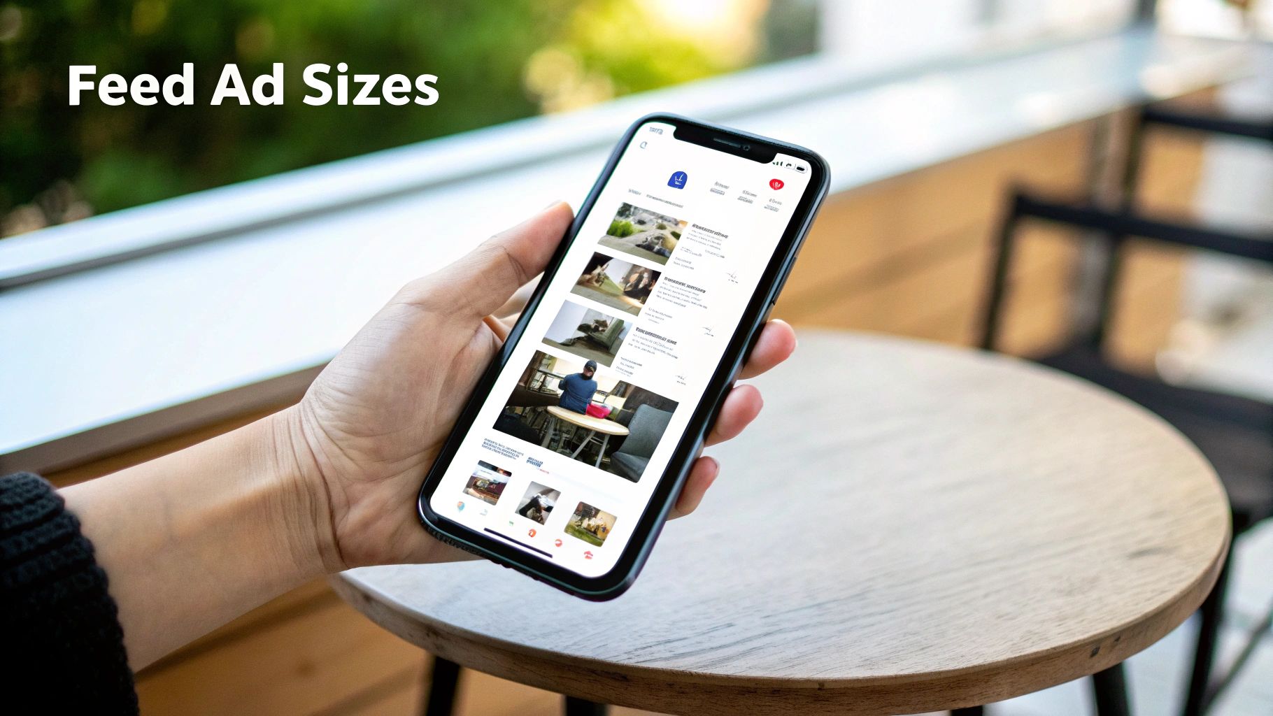
The Facebook Feed is the original, prime real estate for advertisers. Getting your creative specs right here isn’t just a recommendation—it’s non-negotiable for performance. This is where users spend most of their time, making it an incredibly competitive spot to win attention.
To stand out, your ads need to feel native and look sharp, which all starts with using the right dimensions. While the Feed supports a few formats, the undisputed champions are square (1:1) and vertical (4:5). These sizes are tailor-made for mobile, which is exactly where the vast majority of your audience will see your ads.
For static images, the game is all about capturing as much screen space as you can without being disruptive. It’s simple, really: a taller ad often beats a square one because it physically fills more of the screen as someone scrolls.
Opting for the 4:5 aspect ratio is a smart play, especially for mobile-first campaigns. It dominates the vertical space on a phone, pushing competitor content and distractions further away. That said, the 1:1 square is still a versatile workhorse if you're targeting both mobile and desktop users in the same campaign.
Video ads in the Feed operate on similar dimensional rules but come with a few more technical strings attached. Your mission is to grab attention within the first three seconds—that's all the time you have before the user's thumb keeps scrolling.
The best video ads feel like they belong there, blending in with organic content until your hook, caption, or visual cue stops the scroll.
Video Specifications:
Pro Tip: Always, and I mean always, design your videos to be understood with the sound off. The majority of users watch without audio, so lean heavily on bold on-screen text or captions to get your message across.
While the main News Feed gets all the glory, your ads can also pop up in related spots like Facebook Marketplace and the dedicated Video Feed. The good news? The creative specs are nearly identical, which makes asset creation much easier.
For Marketplace, the 1:1 square aspect ratio (1080 x 1080 pixels) is the standard. In the Video Feed, however, a 4:5 vertical format (1080 x 1350 pixels) is your best move to maximize screen real estate among other videos.
Interestingly, while mobile-first formats are king, the old-school landscape ad isn't dead yet. The classic 16:9 format (1200 x 628 pixels) can still pull a respectable industry-average CTR of 2.50%. This can be particularly effective for desktop-heavy campaigns where you have more horizontal space to work with—even if 94.1% of all impressions are now on mobile. To see how these trends are shaping campaigns, it's worth diving into more revealing Facebook statistics.
If you want to win on Facebook and Instagram today, you have to master vertical, full-screen placements. Stories and Reels are where the attention is, and to succeed there, you need to completely ditch the old square and landscape mindset.
The undisputed gold standard is the 9:16 aspect ratio, and the sweet spot for resolution is 1080 x 1920 pixels. This isn't just about technical specs; it's about creating an ad that feels native. People fly through Stories and scroll Reels at lightning speed. Your ad needs to look like it belongs there, not like a clunky, repurposed asset from another placement that screams "I'm an ad!"
This is probably the single most important rule for vertical ads: you have to respect the safe zones. Both Facebook and Instagram plaster their user interface elements all over the top and bottom of the screen. Think about it—your profile icon, the call-to-action button, and even the comment fields can completely cover up parts of your ad.
As you can see, the top and bottom are danger zones for anything important. To play it safe, keep all your critical elements—logo, headline, key text, and product shots—smack in the middle. A good rule of thumb is to leave a buffer of roughly 15% of the total height at both the top and the bottom. Our in-depth guide on Facebook Story size and specifications even has downloadable templates to make this a no-brainer.
Key Insight: Anything outside that central safe zone might as well be invisible. Imagine your primary "Shop Now" call-to-action is hidden behind the app's "Send Message" button. That's a completely wasted impression and ad dollar. Always, always design with these UI obstructions in mind.
While a great static image can work, video is the native language of Stories and Reels. To make sure your video ads look sharp and load instantly, stick to these technical specs.
And remember, unlike the Feed where many people scroll with the sound off, most users watch vertical video with sound on. This is a huge opportunity! Use audio, music, and voiceovers to make your ad that much more immersive.
For a deeper dive into the pixel dimensions and aspect ratios that work best for vertical content, check out this excellent guide on Mastering Vertical Video Dimensions. When you nail both the technical specs and the safe-zone design, you create killer vertical ads that actually stop the scroll.
Beyond the main Feed and immersive Stories, Facebook has a few specialized placements that can round out a killer ad strategy. Two of the most common are In-Stream video ads and Right Column ads—one is designed to interrupt video streams, while the other is a classic, passive format for desktop users.
Getting these specs right is key, as each placement serves a very different purpose and has unique technical quirks. Let's break them down.
You know those short commercials that pop up before, during, or after a video you’re watching on Facebook? Those are In-Stream ads. Your job here is to create something compelling enough to hold a viewer's attention when they're already deep into other content. It's a fantastic way to reach a captive audience, but you have to earn their attention fast.
For this format, a traditional landscape video usually feels the most natural, since it mirrors the content the user is already watching.
Pro Tip: Your ad is an interruption, so you need a strong, immediate hook. You have literally seconds to provide value or spark curiosity. Always lead with your most compelling visual or message right out of the gate.
For a deeper dive, check out our complete guide to video dimensions for Facebook ads, which covers how different formats perform across every placement.
Right Column ads are one of the original Facebook ad formats, appearing exclusively on desktop. They’re the smaller ads that sit patiently on the right-hand side of the main feed. Because of their size and position, they're best for simple, visually-driven messages with a clear call-to-action. This is a great spot for awareness and traffic campaigns targeting people on larger screens.
Think of these as digital billboards—compact and static. Forget complex stories; a strong image and a punchy headline are all you need to win here.
Right Column Ad Specifications:
If you’re in e-commerce, interactive formats like Carousel and Collection ads are absolute gold. They're built to do more than just show a single image—they invite people to swipe, browse, and explore your products right in their feed. But to create that smooth, shoppable experience, you have to nail the specs for every single piece.
These ad types are designed to pack multiple products or features into one neat little unit. They get users to actively engage instead of just scrolling past, which is why they’re so good at driving traffic and sales. Let's break down exactly what you need.
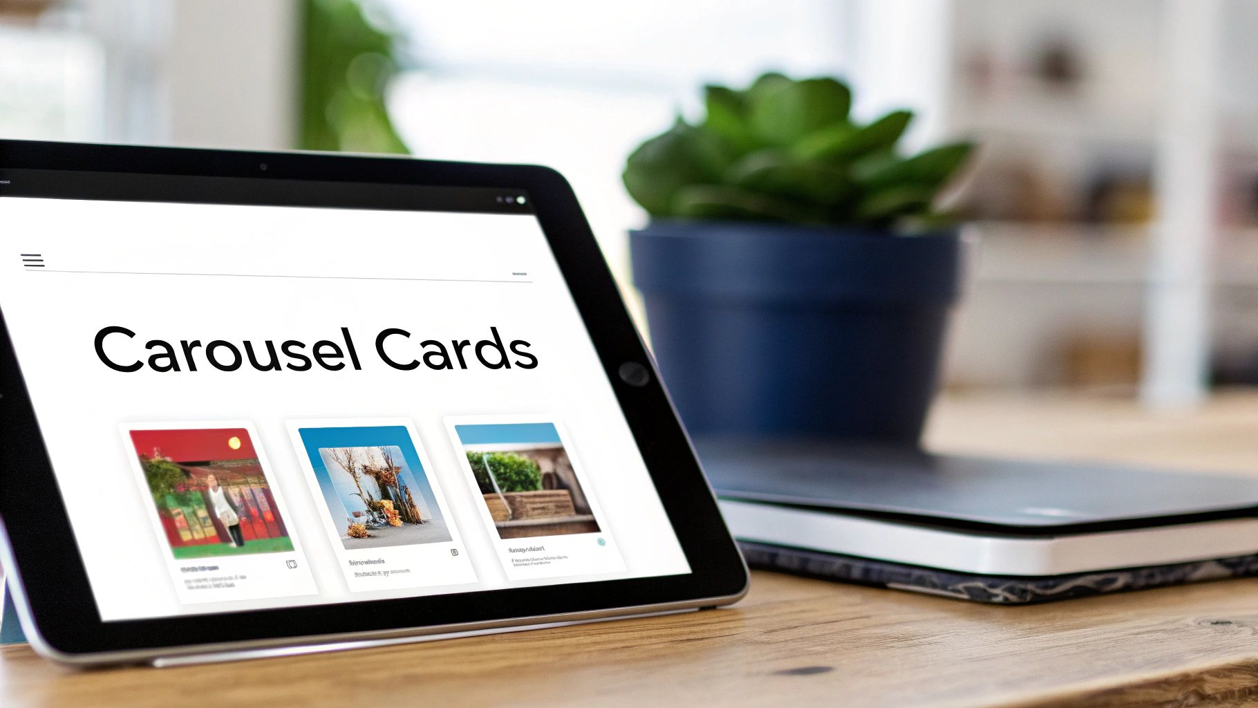
Carousel ads are your go-to for showing off up to 10 images or videos in a single, swipeable ad. Each one is called a "card." This format is perfect for displaying a whole product line, telling a step-by-step story, or diving deep into the features of one killer product.
Consistency is everything here. While you can mix and match images and videos, keeping the aspect ratio the same across all cards makes for the cleanest look. The 1:1 square format is your safest and most versatile bet.
Carousel Card Image Specs:
Carousel Card Video Specs:
Collection ads are a mobile-first powerhouse. They pair a hero image or video with a grid of four product images pulled straight from your catalog. When someone taps the ad, it opens into a full-screen Instant Experience—basically a mini-storefront inside the Facebook app.
This format is a game-changer for retail because it eliminates friction. Customers can browse and shop without ever leaving Facebook. Your main creative has one job: be compelling enough to make them tap.
Pro Tip: A great Collection ad uses the main creative to set a mood or tell a story, then presents the products as the solution. Think a lifestyle video of someone hiking, paired with product shots of the exact boots, backpack, and water bottle they're using.
Collection Ad Main Creative Specs:
The smaller product images that appear below your main creative are pulled from your catalog in Facebook Commerce Manager. Heads up: Facebook automatically crops these to a 1:1 aspect ratio, so make sure your product photos are optimized for a square crop to avoid any weird cut-offs.
Let's be honest, navigating Facebook's ad specs can feel like a moving target. Rules change, placements evolve, and you're left wondering how to get the most bang for your buck. Here are some straight answers to the questions we see marketers and designers ask all the time.
If you're stretched thin and can only make one creative, go with the 1:1 square (1080 x 1080 pixels). Hands down, it's the most versatile and reliable format you can create.
Why? Because a square ad just works everywhere that matters. It looks great in the Facebook and Instagram Feeds, fits nicely into Marketplace, and doesn't look totally out of place in Stories or Reels. It grabs a solid chunk of screen real estate on mobile, making sure your message gets seen. For any campaign on a tight budget, this is your starting point.
Technically, yes. Ads Manager will let you use a single image and will automatically crop it for other placements. But should you? Absolutely not. This is one of the biggest performance killers we see.
Every placement has its own vibe, and your creative needs to feel native to that space. A full-screen 9:16 ad is what people expect to see in Stories, while a 1:1 square is the standard for the Feed. Forcing one size into all slots leads to awkward crops, ugly colored bars filling empty space, or a tiny ad that just looks lazy.
For the best results, always tailor your assets for the main aspect ratios:
Yes, Facebook compresses everything you upload. It has to, otherwise, pages would load painfully slow, especially for users on mobile data. This is precisely why starting with high-resolution source files is non-negotiable.
When you upload a crisp 1080 x 1080 pixel image, you're giving Facebook's compression algorithm a high-quality file to work with. The end result that users see will still look sharp and professional. If you start with a low-res image, it’s going to get compressed into a blurry, pixelated mess that screams unprofessional and tanks your ad's credibility.
Key Takeaway: Always export your creative at the highest possible quality while staying under the file size limits (usually 30MB for images and 4GB for videos). Think of it as your best defense against heavy-handed compression.
Safe zones are absolutely critical for full-screen placements like Stories and Reels. It’s the central area of your ad where you should place all your important stuff—logos, headlines, and call-to-action buttons—so they don't get covered up by the app's interface.
Picture a Story in your head. You've got your profile icon and name at the top, and the "Send Message" bar or CTA at the bottom. The safe zone is everything in between. If your key offer is hiding behind that CTA button, your ad is basically useless.
A solid rule of thumb is to keep all vital information out of the top and bottom 15% of the screen. This guarantees your message is actually seen and acted upon. Pro designers always use a safe zone template to avoid this headache. It's a simple step that prevents a whole lot of wasted ad spend.
Ready to stop wasting time on manual ad uploads and repetitive campaign builds? Lix.so replaces tedious manual work with powerful automation. Upload hundreds of creatives at once, apply reusable templates, and launch your Facebook ad campaigns in seconds, not hours. Try our 7-day free trial and see how much time you can save.
Create hundreds of Facebook Ads campaigns in minutes with Lix.so. Batch creative upload, reusable templates, and automatic campaign generation.
✓ Free for 14 days · ✓ No credit card required · ✓ Cancel anytime