Published by December 15, 2025 · Reading time 20 minutes · Created by Lix.so
When you’re posting on the Facebook feed, the sweet spots are 1080 x 1080 pixels for square images and 1200 x 630 pixels for landscape shots, especially those used in link previews. Nailing these sizes is the first step to making sure your content looks sharp and professional, no matter what device your audience is using.
Getting your Facebook image sizes right is non-negotiable if you want a polished, engaging presence. When images are off, they can end up blurry, awkwardly cropped, or slow to load—all of which are instant turn-offs for users. This guide is here to cut through the noise, starting with a master cheat sheet for when you need the right numbers, fast.
This isn't just about looking good; it's about performance. An image that's sized correctly grabs attention, gets your message across clearly, and flat-out encourages more interaction. For a truly deep dive into every possible Facebook dimension (we're talking images, videos, Stories, and every ad format), check out this complete guide to Facebook post sizes.
To give you a head start, here’s a quick-reference table that breaks down the optimal dimensions, aspect ratios, and best practices for all the major Facebook image placements. Keep this handy, and you'll never have to guess again.
| Placement Type | Recommended Dimensions (Pixels) | Aspect Ratio | Notes and Best Practices |
|---|---|---|---|
| Feed Post (Square) | 1080 x 1080 | 1:1 | The king of mobile engagement. Your go-to for most general posts. |
| Feed Post (Landscape) | 1200 x 630 | 1.91:1 | Perfect for shared links. This format is built to maximize click-throughs. |
| Profile Photo | 170 x 170 (displays) | 1:1 | Upload a larger square image (e.g., 720x720) for clarity. It will display as a circle. |
| Cover Photo | 851 x 315 | ~2.7:1 | Design with mobile-first safe zones in mind. The center 640px is what most users will see. |
| Stories & Reels | 1080 x 1920 | 9:16 | This is the full-screen vertical format. Keep text and logos away from the top and bottom UI elements. |
This table covers the essentials, but let's look a little closer at the two most common formats you'll be using for feed posts.
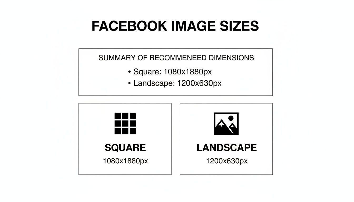
The graphic above really drives home why these two sizes matter. The square format is dominant on mobile feeds, taking up maximum screen real estate, while the landscape format is the standard for driving traffic from links.
While 1200 x 630 pixels has been the reliable standard for years, the game has shifted. With high-DPI mobile screens now accounting for over 98% of Facebook's monthly active users, uploading high-resolution images is crucial to avoid pixelation. Landscape posts at the 1.91:1 aspect ratio are still your best bet for link shares and can pull in significantly higher click-through rates.
And if you're running video content (which you should be!), make sure to check out our detailed guide on https://lix.so/en/posts/video-ads-facebook-specs to ensure your campaigns are fully dialed in.
Think of your Facebook Page's profile and cover photos as its digital handshake. They're the first thing anyone sees, making them your most critical visual real estate. Nailing these dimensions is non-negotiable if you want a professional look; getting it wrong leads to awkward crops and pixelation that can instantly damage your brand's credibility.
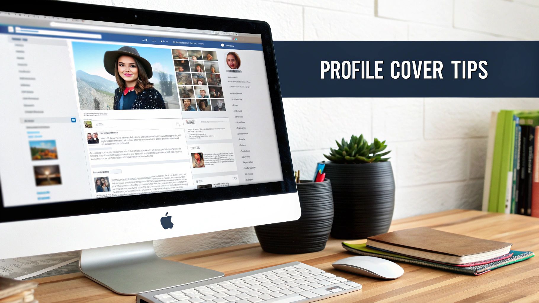
While these two images work as a team to define your brand's identity, they play by very different rules, especially when jumping from desktop to mobile. Understanding their unique quirks is the key to a sharp, cohesive page layout.
Your profile picture is your brand’s tiny ambassador, showing up everywhere from posts and comments to search results. On a desktop, it displays at 170 x 170 pixels, but shrinks to 128 x 128 pixels on smartphones. To keep it looking crisp on high-resolution screens, always upload a larger square image—something like 720 x 720 pixels is perfect—and let Facebook handle the downscaling.
The biggest thing to remember? The circle crop. Facebook automatically forces your square image into a circular frame. This means you have to keep your logo or any key visual elements dead center, otherwise, they’ll get sliced off.
The cover photo is a different beast entirely. It's much larger and, more importantly, it changes its shape dramatically between desktop and mobile. This is where most people get tripped up. On desktops, it’s a wide 851 x 315 pixels. On mobile, it becomes a taller and narrower 640 x 360 pixels.
The secret is designing a single image that accommodates both views by focusing on a mobile-first "safe zone." This is the central area of your image that’s guaranteed to be visible on every single device.
It's a surprisingly common mistake to get this wrong. Research has shown that almost 60% of cover photos have important elements cropped out, often because the profile picture overlaps the bottom-left corner on desktop. By designing for mobile first, you can sidestep these issues and create a much better user experience. If you want to dive deeper, you can discover more insights about social media image dimensions to see how much of an impact proper sizing has.
Here’s the foolproof way to create a cover photo that looks great everywhere:
The Facebook feed is where the magic happens. It's where your content will get the most eyeballs, so nailing your image dimensions here is non-negotiable. Unlike the rigid formats for profile photos or cover images, the feed gives you some creative wiggle room. You’ve got three main shapes to play with, and each one serves a very different purpose.
Your choice of image size should be deliberate. Are you trying to grab as much mobile screen space as possible? Or are you aiming to drive traffic to your latest blog post? The right format makes all the difference.
Get it wrong, and Facebook’s automatic cropping can be brutal, awkwardly cutting off key parts of your message and tanking your post's impact. Let's break down how to get it right every time.
When in doubt, go square. For grabbing maximum attention on mobile, the 1:1 aspect ratio is your most trusted ally. We recommend a size of 1080 x 1080 pixels.
This format takes up the most screen width on a phone, making your post feel substantial and hard to ignore. It’s the ultimate all-rounder, perfect for product shots, infographics, team photos, or brand announcements. The balanced composition means you never have to worry about weird cropping, no matter what device your audience is using.
If your main goal is getting people to click a link—sending them to a blog, a landing page, or a product listing—the landscape format is your best bet. The optimal size is 1200 x 630 pixels, which works out to a 1.91:1 aspect ratio.
This isn't an arbitrary number; it's the exact size Facebook uses for its link preview thumbnails. By designing your image to these specs, you guarantee your preview looks sharp, professional, and perfectly framed. A crisp, well-composed thumbnail is way more enticing and can seriously boost your click-through rates.
Want to truly dominate the screen on mobile? Use a portrait image. Sized at 1080 x 1350 pixels (4:5 aspect ratio), this vertical format takes up more physical space than any other, making it an incredibly effective scroll-stopper.
There’s a catch, though. While it looks fantastic on mobile, Facebook will crop the top and bottom on desktop feeds. Because of this, you absolutely must keep your most important visual elements and text centered. This ensures desktop users don’t miss the point of your post.
And if you're getting creative with animated GIFs, remember that dimensions are just one part of the puzzle. Things like file size and transparency matter, too. For instance, a clean, transparent background can make your animation pop. You can learn more about making GIFs transparent to give your content that extra professional sheen.
When it comes to Facebook Stories and Reels, vertical, full-screen content is king. If you want to create that seamless, immersive feel, you absolutely have to nail the sizing. The universal standard for both of these high-energy placements is 1080 x 1920 pixels. This gives you the perfect 9:16 aspect ratio that completely fills a modern smartphone screen, leaving no wasted space.
Getting the dimensions right ensures your image looks sharp and professional, avoiding those ugly black bars or awkward, unintentional crops that scream "amateur." But just uploading a 1080x1920 image isn't the whole story. You also have to be mindful of the interface elements that Facebook slaps right on top of your beautiful creative.
Here's what a Story looks like on a phone—it's an all-in, edge-to-edge experience.
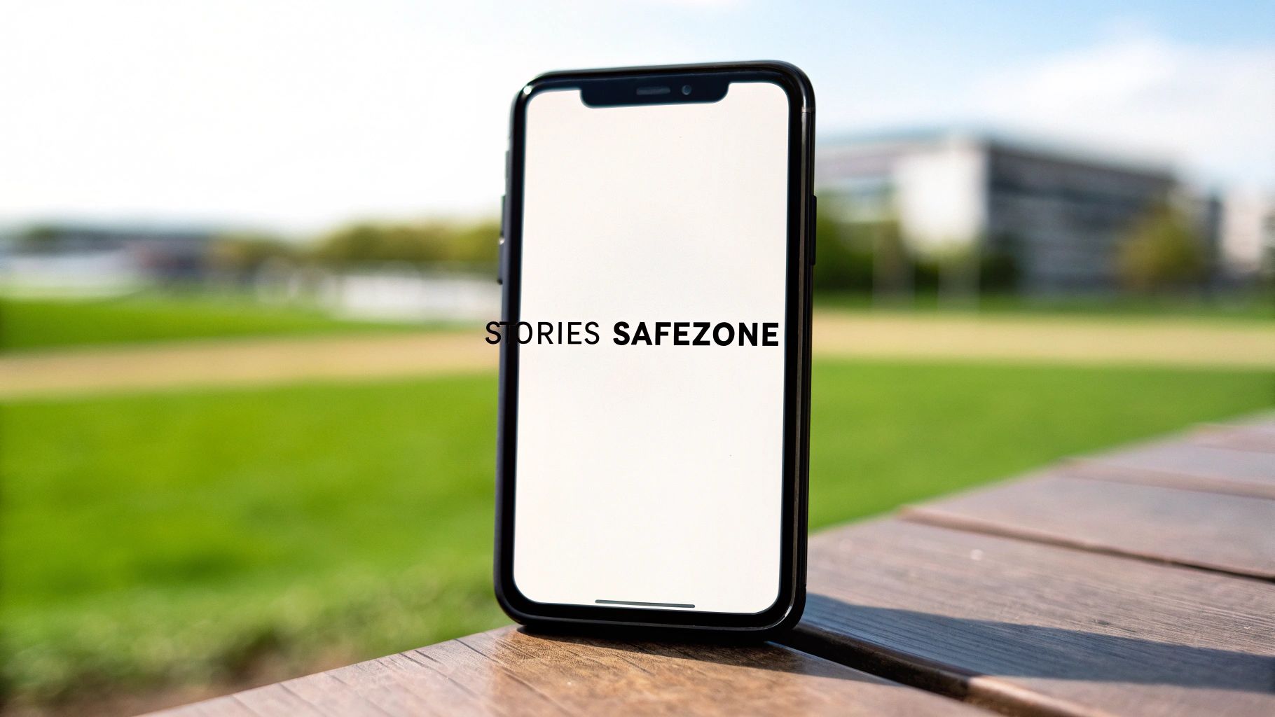
This format is built for vertical viewing, which means you have to design your content from the ground up to grab attention in that orientation.
A classic rookie mistake is getting your key message cut off by Facebook's own interface. To avoid this, you need to design within the "safe zones." Facebook reserves areas at the top and bottom of the screen for things like your profile name, the Story progress bar, and those all-important call-to-action buttons. Any text, logos, or subtitles you place there will get covered up, making your message unreadable.
Stick to these guidelines to keep your content clear and effective:
Think of it this way: your actual usable space is the central part of that 1080 x 1920 canvas. Keep all your important stuff in the middle, and you'll guarantee that every single viewer sees your message without any frustrating obstructions.
For a deeper dive into these constraints with extra examples and templates, check out our guide on the correct Facebook Story size. Once you master these safe zones, you can create static images that feel perfectly at home in these fast-paced, video-first formats.
Once you've got your organic posts down, the next big hurdle is mastering the specs for Facebook Ads and Events. This is where precision really counts. For marketers and community managers, getting these dimensions wrong can mean wasting ad spend on sloppy-looking creative or seeing fewer sign-ups for your next big event.
Every placement is its own unique canvas. A Feed Ad takes up a different space than a Right Column Ad, and a Carousel demands a series of perfectly matched images to work properly. Nail these details, and your calls to action will be clearer and your creative will actually convert.
If you're running paid campaigns, you know the devil is in the details. While many ad formats seem similar, some have very specific requirements that directly impact how well they perform.
Messing up these ad specs isn't just a design issue—it directly hits your campaign's ROI. An ad that looks stretched, blurry, or cropped makes you look unprofessional, leading to lower click-through rates and higher costs.
If you need an even deeper dive into every single placement, including specs for video and story ads, check out our complete guide to Meta ad sizes.
Putting on an event? Your cover photo is the billboard that will either attract people or turn them away. Unlike a personal or page cover photo, the Facebook event cover photo is totally fixed—you cannot reposition it after uploading. What you see is what you get.
The ideal dimension is 1920 x 1005 pixels, which works out to an aspect ratio of about 1.91:1. Because it's locked in place, you have to frame all your critical info—like the event name, date, and main visuals—perfectly within those dimensions before you upload. A badly cropped photo can make your event look amateurish and might even discourage people from signing up.
Here’s a detailed breakdown of the most common ad and community formats to keep handy.
This table provides a quick-reference guide for the image size and ratio requirements for Facebook's most popular ad and community placements.
| Format Type | Recommended Dimensions | Aspect Ratio | Key Considerations |
|---|---|---|---|
| Feed Ad | 1080 x 1080 pixels | 1:1 | Maximizes screen space on mobile. Your most common placement. |
| Right Column Ad | 1080 x 1080 pixels | 1:1 | Desktop only. Keep visuals simple and bold due to smaller display size. |
| Carousel Ad Card | 1080 x 1080 pixels | 1:1 | Each card must be consistent. Ideal for multi-product showcases. |
| Event Cover Photo | 1920 x 1005 pixels | 1.91:1 | Cannot be repositioned. All key info must be framed correctly on upload. |
Using this as a checklist ensures your creative assets are always optimized for their specific placement, helping you avoid common pitfalls and make a stronger first impression.
Even when you follow all the rules, things can still go sideways. You upload a perfect image, and Facebook spits out something... less than perfect. From blurry photos to stubborn link previews that show the wrong thumbnail, these glitches can make your content look unprofessional.
Let's walk through the most common headaches and get your visuals back on track. Most of these problems boil down to one of three culprits: compression, caching, or cropping. Figuring out which one you're up against is the first step.
Ever upload a crystal-clear photo only to see it turn into a blurry, pixelated mess on Facebook? This is almost always caused by Facebook's aggressive compression algorithm. To keep the platform running fast for billions of users, every single image gets compressed to save server space.
The best way to handle this is to give the algorithm less work to do. Always start with a high-quality, high-resolution image saved in the right format—JPG for photos, PNG for graphics with text.
When you upload an image that's already at the recommended size, like 1080 x 1080 pixels for a square post, you're in a much better position. This stops Facebook from having to either over-compress a massive file or stretch a tiny one, both of which will wreck your image quality.
This one is a classic. You share a link to your latest blog post, and the thumbnail that pops up is old, irrelevant, or just plain wrong. This isn’t a sizing issue; it’s a caching problem. The first time a link is shared, Facebook saves (or "caches") the data to speed things up for future shares.
To fix it, you need to force Facebook to clear its cache and grab the latest info from your site.
This little tool is a lifesaver. It shows you exactly what Facebook sees, including the preview image being pulled from your website's Open Graph (OG) tags. By using the debugger, you can confirm your og:image tag is pointing to the right thumbnail before you share the link, ensuring your previews are always on point.
Even with the perfect cheat sheet, things can go wrong. Getting your Facebook images just right often comes with its own set of frustrating little quirks. This is where we tackle the most common headaches we see people run into.
Think of this as the troubleshooting section. From photos that mysteriously lose their sharpness to links that pull the wrong thumbnail, we’ve got the quick and dirty answers to get your content looking professional.
The number one culprit here is almost always Facebook's own compression. To keep the platform running smoothly for billions of users, every single image gets compressed the moment you upload it. If your starting image is already low-resolution or sized incorrectly, that compression can wreck its quality, leaving it soft or pixelated.
The best defense is a good offense. Always start with a high-quality image that already matches the recommended dimensions. For a standard square post, uploading a crisp 1080 x 1080 pixel JPG gives Facebook's algorithm less work to do. By giving it an optimized file, you stop it from aggressively shrinking a huge photo or awkwardly stretching a small one—both of which kill image quality. As a pro tip, for any graphics that include text or sharp lines, try saving them as a PNG. You'll often get much cleaner results.
On mobile, it's a battle for screen real estate. Your best weapons are the 1:1 (square) and 4:5 (vertical) aspect ratios. A square 1080 x 1080 pixel image is a solid, all-around performer. It looks great everywhere and takes up a good chunk of the screen.
But if you really want to stop the scroll, the 4:5 vertical format (1080 x 1350 pixels) is king. It fills up so much more of a phone's vertical screen, making your content feel more immersive and harder to ignore. While landscape images have their place (especially for link previews), they just don't have the same visual punch for a standalone post in the mobile feed.
The takeaway is simple: taller is better on mobile. A 4:5 image can command up to 25% more screen space than a square one, giving you a huge advantage in a crowded feed.
This is a classic—you share a link to your new blog post, but Facebook shows an ancient thumbnail from three years ago. The problem is almost always caching. The first time a link is shared, Facebook saves (or "caches") its info to speed things up later. To fix it, you just need to tell Facebook to take a fresh look.
The official Facebook Sharing Debugger is your go-to tool for this.
If that doesn't do the trick, the issue might be with your website's Open Graph (OG) tags. Double-check the og:image tag in your site's HTML to make sure it's pointing to the right image URL.
Tired of manually resizing and uploading creatives one by one? Lix.so helps you launch entire Facebook ad campaigns in seconds. Upload up to 100 images or videos at once, use reusable templates, and publish directly to Meta without errors. Try it free and see how much time you can save: https://lix.so/en.
Create hundreds of Facebook Ads campaigns in minutes with Lix.so. Batch creative upload, reusable templates, and automatic campaign generation.
✓ Free for 14 days · ✓ No credit card required · ✓ Cancel anytime